

Building Your Corporate React Component Library with Atomic Design Principles and Nx Monorepo
Learn to create a scalable React component library with Atomic Design, an Nx monorepo, and npm. This guide covers setup, component structuring, and tools like Storybook and Jest, ensuring consistency, reusability, and optimized workflows for corporate UI development.

In the rapidly evolving world of web development, organizations are constantly seeking ways to enhance productivity, maintain code consistency, and scale their applications efficiently. One proven strategy is to develop a corporate component library that adheres to atomic design principles within a monorepo architecture. This approach not only streamlines the development process but also ensures a cohesive user experience across all applications.
In this comprehensive guide, we’ll delve deep into how you can build your own scalable corporate component library in React using Atomic Design Principles and an Nx Monorepo. We’ll cover everything from foundational concepts to practical implementation steps, complete with code examples and best practices.
Table of Contents
1. Introduction
2. Understanding Atomic Design Principles
• Atoms
• Molecules
• Organisms
• Templates
• Pages
3. Why Use an Nx Monorepo?
• Benefits of Monorepo Architecture
• Nx Features Overview
4. Setting Up Your Nx Workspace
• Prerequisites
• Installation Steps
5. Implementing Atomic Design in React
• Structuring the Component Library
• Creating Atoms
• Developing Molecules
• Building Organisms
• Designing Templates and Pages
6. Component Development Workflow
• Storybook Integration
• Testing with Jest and React Testing Library
7. Consuming the Component Library
• Internal Consumption within Monorepo
• External Consumption via NPM Registry
8. Best Practices and Tips
• Versioning Strategy
• Code Quality and Linting
• Continuous Integration and Deployment
9. Advanced Topics
• Theming and Styling Solutions
• Accessibility Considerations
• Performance Optimization
10. Conclusion
11. References
Introduction
As organizations grow, so does the complexity of their software applications. Managing multiple projects with shared components can become challenging without a proper structure. A component library serves as a single source of truth for UI elements, promoting reusability and consistency.
By combining Atomic Design Principles with an Nx Monorepo, you can:
• Enhance Reusability: Break down UI into reusable components.
• Ensure Consistency: Maintain a uniform look and feel.
• Improve Collaboration: Enable teams to work on shared components.
• Optimize Performance: Leverage Nx’s build and caching capabilities.
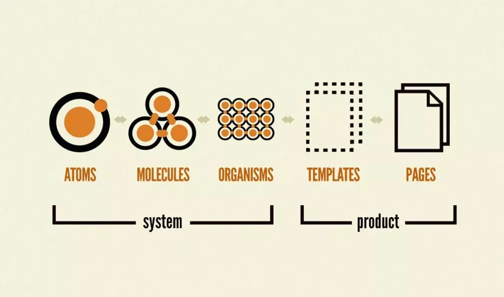
Understanding Atomic Design Principles
Atomic Design is a methodology created by Brad Frost that structures UI components in a hierarchical manner, similar to chemical structures.
Atoms
Definition: The basic building blocks of your UI. They are the smallest units and cannot be broken down further without losing functionality.
Examples:
• Buttons
• Inputs
• Labels
• Icons
• Colors and fonts (design tokens)
Characteristics:
• Self-contained
• Highly reusable
• No dependencies on other components
Molecules
Definition: Simple groups of atoms bonded together. Molecules form relatively simple UI components.
Examples:
• Input fields with labels
• Form controls
• Search bars
Characteristics:
• Composed of multiple atoms
• Encapsulate specific functionality
• Begin to handle user interactions
Organisms
Definition: Complex components composed of groups of molecules and atoms. Organisms form distinct sections of an interface.
Examples:
• Headers
• Footers
• Navigation menus
• Cards
Characteristics:
• Define the structure and layout
• May contain business logic
• Serve as reusable sections
Templates
Definition: Page-level objects that place components into a layout and articulate the design’s underlying content structure.
Examples:
• Page layouts
• Dashboard templates
• Form templates
Characteristics:
• Focus on the page’s skeleton
• Do not include real content
• Define content placement
Pages
Definition: Specific instances of templates filled with real content. Pages are what users interact with in a live application.
Examples:
• Home page
• Product page
• User profile page
Characteristics:
• Display actual data
• The final layer in the hierarchy
• Used for testing UI with real content
Why Use an Nx Monorepo?
Benefits of Monorepo Architecture
A monorepo is a single repository that stores code for multiple projects. It contrasts with a polyrepo, where each project is stored in its own repository.
Advantages
• Code Reusability: Share code between projects easily.
• Simplified Dependencies: Manage dependencies in a centralized manner.
• Consistent Tooling: Use the same tools across projects.
• Atomic Commits: Changes can span multiple projects atomically.
• Simplified Refactoring: Easier to make sweeping changes.
Nx Features Overview
Nx is an advanced set of extensible dev tools for monorepo management, providing:
• Workspace Management: Organize code in apps and libs.
• Powerful CLI: Generate code, run tasks, and more.
• Dependency Graph Visualization: Understand how projects are interconnected.
• Caching and Task Running: Speed up builds with smart caching.
• Extensibility: Support for multiple frameworks and custom plugins.
Why Nx for Component Libraries?
• Integrated Tooling: Built-in support for React, Storybook, Jest, and more.
• Scalable Structure: Easily manage large codebases.
• Efficient Builds: Incremental builds and caching optimize performance.
• Community Support: Active community and regular updates.
Setting Up Your Nx Workspace
Prerequisites
Before starting, ensure you have the following installed:
• Node.js: Version 14.x or later.
• npm: Version 6.x or later (comes with Node.js).
• Git: For version control.
Installation Steps
1. Install the Nx CLI Globally
npm install -g nx
2. Create a New Nx Workspace
npx create-nx-workspace@latest my-company
When prompted:
• Workspace name: my-company (or your preferred name).
• Preset: Choose empty to start from scratch.
• CLI: Select Nx (or Angular if you prefer).
• Use Nx Cloud?: Optional, but recommended for distributed caching.
3. Navigate to the Workspace
cd my-company
4. Add React Capabilities
Since we’re building a React component library:
npm install --save-dev @nrwl/react
5. Initialize Git Repository (Optional)
If you haven’t already:
git init
git add .
git commit -m "Initial commit"
Implementing Atomic Design in React
Structuring the Component Library
1. Generate a New Library
nx generate @nrwl/react:library ui-components --publishable --importPath=@my-company/ui-components
• --publishable: Makes the library ready for publishing.
• --importPath: Defines the package name for imports.
2. Project Structure
The library will be created at libs/ui-components. Organize it according to atomic design principles:
libs/
  ui-components/
    src/
      lib/
        atoms/
          button/
          input/
          label/
        molecules/
          form-field/
          card/
        organisms/
          header/
          footer/
        templates/
          main-layout/
        pages/
          home-page/
Creating Atoms
Atoms are the foundation of your component library.
Example: Button Component
File Structure:
libs/ui-components/src/lib/atoms/button/
  - Button.tsx
  - Button.types.ts
  - Button.styles.ts
  - Button.test.tsx
- Button.stories.tsxButton.tsx:
import React from 'react';
import { ButtonProps } from './Button.types';
import './Button.styles.css';

export const Button: React.FC<ButtonProps> = ({
  label,
  onClick,
  disabled = false,
  variant = 'primary',
}) => {
  return (
    <button
      className={`button button--${variant}`}
      onClick={onClick}
      disabled={disabled}
    >
      {label}
    </button>
  );
};
Button.tsx
import React from 'react';
import { ButtonProps } from './Button.types';
import './Button.styles.css';

export const Button: React.FC<ButtonProps> = ({
  label,
  onClick,
  disabled = false,
  variant = 'primary',
}) => {
  return (
    <button
      className={`button button--${variant}`}
      onClick={onClick}
      disabled={disabled}
    >
      {label}
    </button>
  );
};
Button.types.ts:
export interface ButtonProps {
  label: string;
  onClick: () => void;
  disabled?: boolean;
  variant?: 'primary' | 'secondary' | 'tertiary';
}
Button.styles.css:
.button {
  padding: 8px 16px;
  border: none;
  cursor: pointer;
}

.button--primary {
  background-color: #0070f3;
  color: #ffffff;
}

.button--secondary {
  background-color: #e2e8f0;
  color: #1a202c;
}

.button--tertiary {
  background-color: transparent;
  color: #1a202c;
}
Button.test.tsx:
import React from 'react';
import { render, fireEvent } from '@testing-library/react';
import { Button } from './Button';

test('Button renders with correct label', () => {
  const { getByText } = render(<Button label="Click Me" onClick={() => {}} />);
  expect(getByText('Click Me')).toBeInTheDocument();
});

test('Button handles onClick event', () => {
  const handleClick = jest.fn();
  const { getByText } = render(<Button label="Click Me" onClick={handleClick} />);
  fireEvent.click(getByText('Click Me'));
  expect(handleClick).toHaveBeenCalledTimes(1);
});
Button.stories.tsx:
import React from 'react';
import { Button } from './Button';
import { Meta, Story } from '@storybook/react';
import { ButtonProps } from './Button.types';

export default {
  title: 'Atoms/Button',
  component: Button,
} as Meta;

const Template: Story<ButtonProps> = (args) => <Button {...args} />;

export const Primary = Template.bind({});
Primary.args = {
  label: 'Primary Button',
  variant: 'primary',
};

export const Secondary = Template.bind({});
Secondary.args = {
  label: 'Secondary Button',
  variant: 'secondary',
};

export const Disabled = Template.bind({});
Disabled.args = {
  label: 'Disabled Button',
  disabled: true,
};
Developing Molecules
Molecules combine atoms to form more complex components.
Example: InputField Component
File Structure:
libs/ui-components/src/lib/molecules/input-field/
  - InputField.tsx
  - InputField.types.ts
  - InputField.styles.ts
  - InputField.test.tsx
  - InputField.stories.tsx
InputField.tsx:
import React from 'react';
import { InputFieldProps } from './InputField.types';
import { Label } from '../../atoms/label/Label';
import { Input } from '../../atoms/input/Input';
import './InputField.styles.css';

export const InputField: React.FC<InputFieldProps> = ({
  label,
  value,
  onChange,
  placeholder,
  type = 'text',
}) => {
  return (
    <div className="input-field">
      <Label text={label} />
      <Input
        value={value}
        onChange={onChange}
        placeholder={placeholder}
        type={type}
      />
    </div>
  );
};
InputField.types.ts:
export interface InputFieldProps {
  label: string;
  value: string;
  onChange: (value: string) => void;
  placeholder?: string;
  type?: string;
}
InputField.styles.css:
.input-field {
  display: flex;
  flex-direction: column;
  margin-bottom: 16px;
}
InputField.test.tsx:
import React from 'react';
import { render, fireEvent } from '@testing-library/react';
import { InputField } from './InputField';

test('InputField renders with correct label', () => {
  const { getByText } = render(
    <InputField label="Username" value="" onChange={() => {}} />
  );
  expect(getByText('Username')).toBeInTheDocument();
});

test('InputField calls onChange handler', () => {
  const handleChange = jest.fn();
  const { getByPlaceholderText } = render(
    <InputField
      label="Username"
      value=""
      onChange={handleChange}
      placeholder="Enter username"
    />
  );
  fireEvent.change(getByPlaceholderText('Enter username'), {
    target: { value: 'john_doe' },
  });
  expect(handleChange).toHaveBeenCalledWith('john_doe');
});
InputField.stories.tsx:
import React, { useState } from 'react';
import { InputField } from './InputField';
import { Meta, Story } from '@storybook/react';
import { InputFieldProps } from './InputField.types';

export default {
  title: 'Molecules/InputField',
  component: InputField,
} as Meta;

const Template: Story<InputFieldProps> = (args) => {
  const [value, setValue] = useState('');
  return <InputField {...args} value={value} onChange={setValue} />;
};

export const Default = Template.bind({});
Default.args = {
  label: 'Username',
  placeholder: 'Enter your username',
};
Building Organisms
Organisms are complex UI components composed of molecules and atoms.
Example: Header Component
File Structure:
libs/ui-components/src/lib/organisms/header/
 - Header.tsx
 - Header.types.ts
 - Header.styles.ts
 - Header.test.tsx
 - Header.stories.tsx
Header.tsx:
import React from 'react';
import { HeaderProps } from './Header.types';
import { Logo } from '../../atoms/logo/Logo';
import { Navigation } from '../../molecules/navigation/Navigation';
import './Header.styles.css';

export const Header: React.FC<HeaderProps> = ({ links }) => {
  return (
    <header className="header">
      <Logo />
      <Navigation links={links} />
    </header>
  );
};
Header.types.ts:
export interface HeaderProps {
  links: Array<{
    label: string;
    href: string;
  }>;
}
Header.styles.css:
.header {
  display: flex;
  justify-content: space-between;
  align-items: center;
  padding: 16px;
}
Header.test.tsx:
import React from 'react';
import { render } from '@testing-library/react';
import { Header } from './Header';

test('Header renders with logo and navigation', () => {
  const links = [
    { label: 'Home', href: '/' },
    { label: 'About', href: '/about' },
  ];
  const { getByAltText, getByText } = render(<Header links={links} />);
  expect(getByAltText('Company Logo')).toBeInTheDocument();
  expect(getByText('Home')).toBeInTheDocument();
  expect(getByText('About')).toBeInTheDocument();
});
Header.stories.tsx:
import React from 'react';
import { Header } from './Header';
import { Meta, Story } from '@storybook/react';
import { HeaderProps } from './Header.types';

export default {
  title: 'Organisms/Header',
  component: Header,
} as Meta;

const Template: Story<HeaderProps> = (args) => <Header {...args} />;

export const Default = Template.bind({});
Default.args = {
  links: [
    { label: 'Home', href: '/' },
    { label: 'Services', href: '/services' },
    { label: 'Contact', href: '/contact' },
  ],
};
Designing Templates and Pages
While templates and pages are not always components themselves, they are essential for laying out the structure of your application.
Templates
Create a MainLayout template that includes the Header, Footer, and a content area.
MainLayout.tsx:
import React from 'react';
import { Header } from '../organisms/header/Header';
import { Footer } from '../organisms/footer/Footer';
import './MainLayout.styles.css';

export const MainLayout: React.FC = ({ children }) => {
  return (
    <div className="main-layout">
      <Header
        links={[
          { label: 'Home', href: '/' },
          { label: 'About', href: '/about' },
        ]}
      />
      <main>{children}</main>
      <Footer />
    </div>
  );
};
MainLayout.styles.css:
.main-layout {
  display: flex;
  flex-direction: column;
  min-height: 100vh;
}

.main-layout > main {
  flex: 1;
}
Pages
Pages are typically part of your application, but you can create example pages within your component library for documentation purposes.
Component Development Workflow
A consistent development workflow is crucial for maintaining code quality and productivity.
Storybook Integration
Storybook is an open-source tool for developing UI components in isolation.
1. Add Storybook to the Library
nx generate @nrwl/react:storybook-configuration ui-components
This will start Storybook on http://localhost:4400, showcasing your components.
3. Writing Stories
Stories are examples of how components can be used. We’ve already included .stories.tsx files in our examples.
Best Practices:
• Atomic Organization: Organize stories according to atomic design levels.
• Controls: Use Storybook’s controls to allow dynamic interaction.
• Documentation: Use comments and descriptions to explain components.
Testing with Jest and React Testing Library
Testing ensures your components work as expected.
1. Running Tests
nx test ui-components
2. Writing Tests
Use Jest and React Testing Library to write unit tests.
Best Practices:
• Coverage: Aim for high test coverage.
• Descriptive Tests: Use clear and descriptive test names.
• Isolation: Test components in isolation.
Consuming the Component Library
Internal Consumption within Monorepo
When your applications are within the same Nx workspace, consuming the library is straightforward.
Importing Components:
import { Button } from '@my-company/ui-components';
This works because Nx sets up path mappings in tsconfig.json.
External Consumption via NPM Registry
To use the library outside of the monorepo, you need to publish it.
1. Build the Library for Production
nx build ui-components
This compiles the library and outputs it to dist/libs/ui-components.
2. Publish to NPM or Private Registry
First, ensure your package.json in dist/libs/ui-components is correctly configured.
package.json:
{
  "name": "@my-company/ui-components",
  "version": "1.0.0",
  "main": "index.js",
  "module": "index.esm.js",
  "types": "index.d.ts",
  "peerDependencies": {
    "react": "^17.0.0",
    "react-dom": "^17.0.0"
  }
}
Then, publish:
cd dist/libs/ui-components
npm publish --access public
Note: Use --access public for public packages, or omit for private registries.
3. Install in External Projects
npm install @my-company/ui-components
Best Practices and Tips
Versioning Strategy
• Semantic Versioning: Use semver to manage versions.
• Changelogs: Maintain a changelog to document changes.
• Automated Releases: Use tools like semantic-release for automated versioning.
Code Quality and Linting
• ESLint: Enforce coding standards.
• Prettier: Ensure consistent formatting.
• Husky and Lint-Staged: Run linters and formatters on commit.
Setting Up ESLint and Prettier
npm install --save-dev eslint prettier eslint-config-prettier eslint-plugin-react
.eslintrc.js:
module.exports = {
  extends: ['react-app', 'plugin:prettier/recommended'],
  rules: {
    // Your custom rules
  },
};
Continuous Integration and Deployment
• CI Pipelines: Set up CI pipelines using GitHub Actions, Jenkins, or CircleCI.
• Automated Testing: Run tests and linters on every push.
• Automated Builds: Build and publish libraries automatically.
Advanced Topics
Theming and Styling Solutions
Consider using CSS-in-JS libraries or CSS Modules for styling.
• Styled Components: Dynamic styling with props.
• Emotion: Similar to Styled Components with additional features.
• CSS Modules: Scope CSS to components.
Example with Styled Components
npm install --save styled-components
Button.tsx:
import React from 'react';
import styled from 'styled-components';
import { ButtonProps } from './Button.types';

const StyledButton = styled.button<ButtonProps>`
  padding: 8px 16px;
  border: none;
  cursor: pointer;
  background-color: ${(props) =>
    props.variant === 'primary' ? '#0070f3' : '#e2e8f0'};
  color: ${(props) => (props.variant === 'primary' ? '#ffffff' : '#1a202c')};
`;

export const Button: React.FC<ButtonProps> = ({ label, onClick, variant }) => {
  return (
    <StyledButton onClick={onClick} variant={variant}>
      {label}
    </StyledButton>
  );
};
Accessibility Considerations
Ensure your components are accessible:
• ARIA Attributes: Use ARIA attributes where necessary.
• Keyboard Navigation: Ensure components are operable via keyboard.
• Semantic HTML: Use appropriate HTML elements.
• Testing: Use tools like Axe or React Testing Library’s accessibility features.
Performance Optimization
• Tree Shaking: Export components properly to enable tree shaking.
• Lazy Loading: Use React’s lazy and Suspense for code splitting.
• Memoization: Use React.memo and useMemo to prevent unnecessary re-renders.
Conclusion
Building a corporate component library using Atomic Design Principles within an Nx Monorepo offers numerous advantages:
• Scalability: Easily manage and scale your component library.
• Consistency: Maintain a uniform UI across all applications.
• Efficiency: Streamline development with shared components and tooling.
• Collaboration: Foster better collaboration among teams.
By following the steps outlined in this guide, you can set up a robust and scalable component library that will serve as the foundation for your organization’s frontend development efforts.
References
• React Official Documentation
Thank you for reading! If you have any questions or need further assistance, feel free to reach out or leave a comment below.
Happy coding!